
Spring 2025 Paint Color Trends
Spring 2025 Paint Color Trends
As we move into Spring 2025, the world of interior design embraces a return to softness, muted hues, mineral neutrals, and layered natural tones that feel lived-in, timeless, and deeply personal. At bee designe, we believe in creating spaces that breathe, and this season’s color trends echo that philosophy beautifully.
From historic brownstone neutrals to soft coastal hues inspired by Boston’s seaside charm, this spring is all about wall colors that feel quiet yet intentional, colors that support the life unfolding within a space without ever overpowering it.
Farrow & Ball - Setting Plaster
Our Favorite Palettes:
The Soft Coastal Palette
One of the standout trends this season is the Soft Coastal Palette, a collection of airy neutrals with a whisper of sea mist and reflected sky. Perfect for waterfront homes or apartments seeking a bit more light, this palette creates a sense of breathability that echoes the softness of ocean air and early morning fog. We’re reaching for hues like Farrow & Ball’s Cromarty, a misty sage-green that feels serene and airy; Benjamin Moore’s Ballet White, a soft stone tone that brings calm to living spaces; and Ashes by Portola Paints, a mineral mushroom hue that grounds without weighing down.
The Historic Brownstone Neutrals Palette
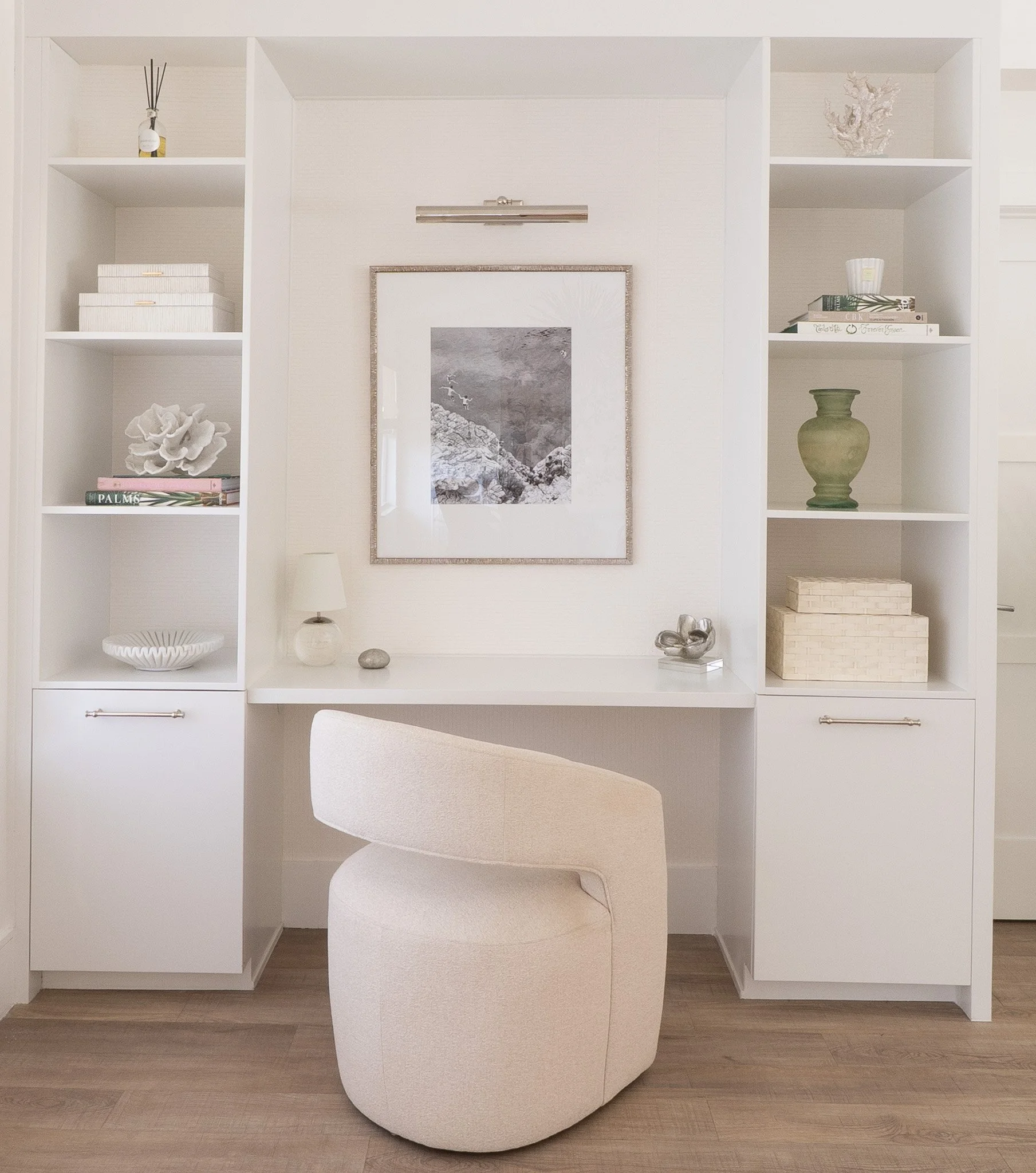
Equally relevant for Boston’s more traditional neighborhoods is our Historic Brownstone Neutrals palette. These tones are inspired by the time-worn elegance of the Back Bay and Beacon Hill, combining warmth with subtle structure. Colors like Benjamin Moore’s Classic Gray, Farrow & Ball’s School House White, and Setting Plaster — a delicate, faded blush — add dimension and character to spaces without overwhelming them. These hues celebrate the architectural heritage of Boston while offering a timeless canvas for modern life.
The Modern Urban Neutrals Palette
For more contemporary spaces, such as lofts and renovated townhomes, we’re leaning into Modern Urban Neutrals — breathable grays and soft charcoals that add mood without making a room feel heavy. These tones bring subtle drama and sophistication, perfect for open layouts and high ceilings. Our favorite choices include Portola Paints’ Ashes for its earthy gray tone, Benjamin Moore’s Revere Pewter — a timeless taupe that adapts effortlessly to changing light — and Farrow & Ball’s Drop Cloth, a soft putty neutral that creates a cozy, enveloping atmosphere.

Benjamin Moore- Ballet White
Tips for Choosing the Perfect Spring Paint Color
1. Let the Light Lead
Natural light has the power to completely transform how a paint color feels in a space. That’s why it's essential to consider the orientation of each room. North-facing rooms tend to receive cooler, indirect light, which can make certain colors feel flat or shadowed, so warmer neutrals and soft blushes often work best there. Meanwhile, south-facing rooms are bathed in warm sunlight for much of the day, making them an ideal canvas for cooler tones like misty greens or pale grays that won’t appear too yellow or washed out.
2. Create Emotional Zones
Color isn’t just visual. It is deeply emotional. Thoughtfully chosen hues can help define the mood of each space in your home. A gentle sage in the bedroom invites rest and calm, while a grounding taupe in the living room creates a cozy, welcoming energy. In the kitchen, creamy whites and soft stones evoke cleanliness and lightness, enhancing the feeling of freshness that’s perfect for spring. By assigning each space a subtle emotional tone through color, you can support the way you want to live and feel in your home.
3. Don’t Over-Saturate
This season is all about subtlety and softness. Rather than leaning into overly bold or heavily pigmented colors, choose hues with a chalky or mineral-like quality that feel more organic and forgiving. These quieter tones allow your space to feel open and restful, making them perfect for spring refreshes that won’t overwhelm. Think in terms of whisper, not shout, colors that support your surroundings, not dominate them.
4. Think Texture, Not Just Color
Color is only part of the story. The finish you choose plays a major role in how a room feels. A matte or limewash finish adds an understated, velvety texture that’s ideal for serene bedrooms or cozy dens. Soft eggshell finishes offer just a hint of light reflection, adding warmth and liveliness to high-traffic areas like hallways or kitchens. Layering soft color with the right finish introduces depth, character, and a feeling of material richness that elevates even the most minimal palette.

bee designe's Go-To Spring Paint Picks
Farrow & Ball — Cromarty: Misty sage-green for serene bedrooms
Benjamin Moore — Ballet White: Soft stone neutral for breezy living rooms
Farrow & Ball — Setting Plaster: Faded fresco blush for elegant dining rooms
Portola Paints — Ashes: Mineral mushroom tone for grounding entryways
Benjamin Moore — Classic Gray: Timeless pale neutral for cohesive open-plan spaces
Where Design Begins
At bee designe, we believe the right paint color is never just a backdrop, it’s the beginning of a feeling. Whether you're refreshing one room or reimagining your entire home, let your walls breathe this spring with colors that feel quietly lived-in, timeless, and beautifully your own.